ACCESSIBILITY GUIDELINES FOR METADATA FILES
- 2.1 Lists
- 2.2 Formatting
- 2.3 Hyperlinks
- 2.4 Images
- 2.5 Tables
- 2.6 Dates format
- 2.7 Language
- 2.8 Use of colours
- 2.9 Good practices
For service support, please contact: |
| Last reviewed : 12-12-2024 |
| ESSMH web portal |
1. Introduction
Accessibility is crucial in ensuring that content is usable by everyone, regardless of their abilities. The aim of accessibility is to provide equal access to information for all individuals, including those with disabilities. When creating metadata files, respecting accessibility guidelines is particularly important, as it enables users to navigate and understand the content more easily. By following these guidelines, content creators (national data providers and Eurostat domain managers) can ensure that their metadata files are perceivable, operable, and understandable by everyone, including those who rely on assistive technologies. This is crucial for promoting inclusivity, equality, and social participation, ultimately benefiting society as a whole.
To achieve these goals, it is necessary to understand the specific accessibility guidelines and requirements that apply to metadata files. The following section outlines the key accessibility topics and guidelines that should be followed when creating a metadata file.
2. Accessibility topics
The accessibility guidelines outlined in this section provide the requirements to be respected when writing a metadata file. It is based on the European accessibility act and Eurostat’s accessibility guidelines tailored for the metadata files. To improve usability, the guidelines are structured by topics and tables. “Requirement” guidelines in the first column of the tables provide recommendations on how to solve the identified errors in order to make the document accessible. The second column, called “Quality measures errors and FAQs” provide the errors identified based on the newly implemented ESS-MH features.
An FAQ page is also available to guide and provide the answers to the most frequently asked questions related to accessibility guidelines. The FAQ link is displayed in the second column, "Quality Measures Errors and FAQs", if available.
2.1 Lists
Requirement | Quality measures errors and FAQs |
To properly create lists, use the built-in markup tools of your editor. Don’t create fake bullets with hyphens for instance. For ease of reading, we generally
| List markers for review See FAQ. |
2.2 Formatting
Requirement | Quality measures errors and FAQs |
| Don’t use text formatting (bold, italic, strikethrough nor any visual styles) to convey key information such as “Items in bold are still available, items in strikethrough are not available anymore”. Screen readers don’t spontaneously mention the visual aspect of text. Instead, use lists – say “The following items are still available:”. | See FAQ. |
| Avoid using italics, except for a term in another language or very short emphasized terms | |
| Bold font to be used sparingly, of maximum 3-4 words in a sentence, or to emphasize a sub-section of a concept. | |
| For quotes, please use the following: quote marks, indentation, author cited… | See FAQ. |
| Don't underline anything but links | See FAQ. |
| Use Left alignment for the text instead of Justified. Justified text is not allowed. | See FAQ. |
2.3 Hyperlinks
Requirement | Quality measures errors and FAQs |
| Meaningful link labels - Link labels should tell the user where they will end up when they click on them. | Link label should be more meaningful See FAQ. |
| In sentences, avoid links on meaningless terms like “click here”, “here”, “more”, “read more”. Links should be intuitive and meaningful even when extracted from their context. | Link label should be more meaningful See FAQ. |
| Avoid links on URLs: rather use the target page title or the website name as link. | Link label should be more meaningful |
| As far as possible, name similarly all links to the same target across a page or website (so that the user knows he already visited that related page from another location). There can be variation due to the different sentence structure (verb instead of name, plural instead of singular…), but keep the links similar. | See FAQ. |
| Links should be underlined to make them easy to identify even with colour-blindness. If a different colour is used for the links, make sure the colour complies with colour contrast rules. | See FAQ. |
| Identify hyperlinks without an attached link (the hyperlink appears as a text). First, because all hyperlinks should be clickable, and second, all hyperlinks, as stated above, should be accompanied by a meaningful name/label. | URL is not linked See FAQ. |
| The text is blue and underlined, but there is no link attached to it. | There is no link attached See FAQ. |
Don’t TIPS:
|
2.4 Images
Requirement | Quality measures errors and FAQs |
Every image should have an appropriate alternative text. See below some tips for creating a good alternative text. Tips:
2. What is not needed in the alt text:
| Images without an AltText See FAQ. |
If a complex image (like a chart) has an alternative in the form of one of the following:
mention this in the short description of the image (“alt text”), so that blind visitors know where to find an alternative version of the content. For instance, “Milk production trend in EU from 2002 to 2020, see data table below”. | Images without an AltText See FAQ. |
For charts, you may include in the alternative description:
| Images without an AltText See FAQ. |
For formulas, insert AltText to explain what is behind the formula. If an image contains formulas and text in between, split the image in smaller images in order to keep the text out of the image. Example: 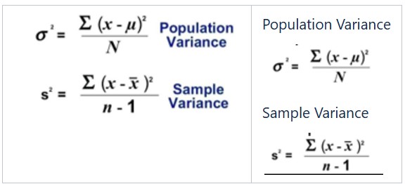 | See FAQ. |
Images should be imported using the ESS-MH Wizard menu, “Paste image from file” feature:  | Embedded image See FAQ. |
Images should be imported using the ESS-MH Wizard menu, “Paste image from file” feature:  | Missing ID See FAQ. |
2.5 Tables
Requirement | Quality measures errors and FAQs |
| For simple data tables, make sure the 1st row, or the 1st column is properly marked as a header, via the built-in feature of your editor | Missing thead tag for table See FAQ. |
| For matrix tables that have both a 1st row and 1st column crossing headers, both must be marked as such via the built-in feature of your editor | Missing thead tag for table Missing th tag for table See FAQ. |
| If possible, avoid empty cells that make it more complex to get an overall idea of the table structure for blind visitors. Also, do not use “X”, “NA” etc. to mark that the cell has no value. Use “Not applicable”, “Not available”, “No value”, “Unknown” for instance. This can be hidden to sighted readers, for instance by using white font. | See FAQ. |
| Don't use any highlighting. The table should have no colour. | See FAQ. |
| Merged cells to be used in the table headers only, but not inside the table. In the header of the columns/rows it is needed to properly set-up the row and column spans). | See FAQ. |
Align text correctly:
|
2.6 Dates format
Requirement | Quality measures errors and FAQs |
| Write the day as a number and the month in letters - e.g. 12 May. In the metadata files, especially the concept 2. Metadata update is affected. If possible write the dates, instead of 18/12/2012 - replace with 18 December 2012. | Please review and adapt date formats to dd Month YYYY, e.g. 1 January 2024 See FAQ. |
2.7 Language
Requirement | Quality measures errors and FAQs |
English is the standard language for all metadata files. If extended content is in any other language, it should be flagged. To be noted that exception from this case is for the title of publications, news releases, laws, name of the questionnaires, NUTS regions etc. which should be accompanied with a translation in English of these titles. Words in another language inside a paragraph will need to get properly marked so that screen readers adapt their pronunciation. This does not apply to foreign terms frequently used in the other language, like “parking”, “design” etc. In ESS-MH we can use quotes (“foreign term”) to mark foreign terms. |
2.8 Use of colours
Requirement | Quality measures errors and FAQs |
| Don’t use any highlighting of the text | |
| Don’t use any font colour for the text, except for the hyperlinks, that should follow the colour contrast rules. |
2.9 Good practices
Requirement | Quality measures errors and FAQs |
| Apply good practices of web writing such as: short paragraphs and sentences, plain English with no jargon, active voice. |